

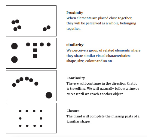
The visual design of an app is more than a superficial layer: good design guides the user by communicating purpose and priority.
Space
If the shape is positioned centrally, the space will appear neutral, balanced and a little sterile. Moving the shape off-centre creates tension, adding interest for the viewer and encouraging further exploration.
When multiple shapes are incorporated, the spatial relationship and interaction of the shapes becomes the primary focus of the design.
Negative space
Negative space, commonly referred to as white space, is the area of the design not occupied by compositional elements. Gestalt theory has a name for this too: it is the ground, and the main compositional elements are the figure.
Compositional balance
The size and position of elements in a composition will determine its balance
Similar to physical objects pushing down on a sheet of paper, the balance of design elements on screen is dictated by weight, not size alone. The darker or more vivid a colour, the heavier it is: a large, lightly coloured object can be balanced with a smaller, darker object.
Grid systems
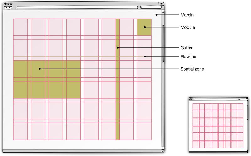
Grids are particularly suitable for web app design where repeated, practical operation of the app demands clarity and consistency over shock-and-awe design. Even so, you may need to occasionally emphasise a part of the page, such as an important item in a list, or an error message. You can grab additional attention by breaking the rules: shifting an element off the grid.
Source
This post is base entirely on an awesome article:
- A Practical Guide to Web App Success: Visual composition by Dan Zambonini of Bipsync Research Management Software.
- http://webappsuccess.com/visual-composition.html